Nielsen Ratings
- George Fane

- Jul 17, 2019
- 3 min read
Updated: Oct 6, 2019
Nielsen Media Research often reports shows as percent of all households with a TV watching that show/percent of households with their TVs on watching that show. However, those two values seem somewhat redundant because one value probably can be used to determine the other.
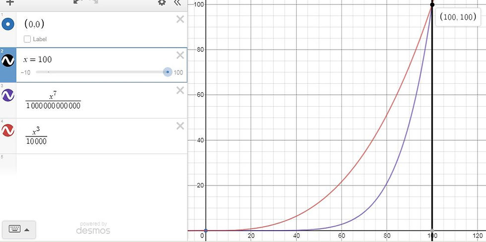
The red line shows percent of households with their TVs on watching a certain show while the purple line shows percent of TV households watching a certain show. The y-axis is a percentage (either one of the two Nielsen values) and the x-axis is shows by viewership percentile (at x=0, the show has no viewers, and at x=100, the show has every single TV household tuned in).
Graph 1 may represent any show's Nielsen rating. No TV households, whether or not their TV is on, watch the 0th percentile show (perhaps McEnroe), while the hypothetical 100th percentile show is a Super Bowl between the '60s Beatles and Kennedy's announcing the OJ verdict at halftime, captivating all households with a TV. Both endpoints are clearly extremities and are unlikely, but the middle range represents typical shows.
Because Nielsen ratings can be modeled like Graph 1 (the general shape is probably accurate even if both curves should have lower values for all but the very highest percentiles), one of the two Nielsen percentages can probably be used to predict the other. Nielsen should not put out both values as its main rating.
I suggest percent of TV households watching that show/percent of TV households in the 18-49 year old demographic watching that show. By including a rating for young people, this new pair includes new advertiser-useful information that could not have been gleaned from the old pair.
Sometimes a show displays only its 18-49 rating, which has the same issue as the old pair: it only offers information on a single group. Ratings should cover both the 18-49 group as well as viewers of all ages.
Analyzing Current Nielsen Ratings

The red line shows the percent of TV households at each show percentile with their TV's off, which simply reflects that shows with extremely high current Nielsen ratings can drive much of America to turn on their TV's, It makes sense that at low x-values, most Americans do not have their TV's on. Perhaps most shows at such percentiles run at 4 AM. However, Graph 2's curve does not appear accurate, at least as the show percentile approaches 0; more than 100% of TV households cannot have their TV's off.

Subtracting the two Nielsen ratings yields Graph 3, perhaps a more useful curve. That local maximum at x=81 most likely represents prime-time shows that draw in large audiences in their own right but are up against other networks' prime-time programming. Admittedly, subtracting the two ratings does not directly yield what percent of TV households watch or don't watch a certain show, but most prime-time shows likely rest around the 80th percentile.
-------------------------------------------
Nielsen ratings are losing relevance at perhaps the fastest pace ever. Its redundancy explained above does not seem to be a major cause: merely something I hypothesized and wanted to model. Rather, the importance of Nielsen ratings seems to decline as advertising focuses more and more on digital media. Even in the TV realm, paid-streaming services without ads may soon overtake traditional cable subscriptions judging by customer amounts.
Until then, however, Nielsen ratings as they are today succinctly offer TV show viewership data. Nevertheless, making the change of publishing together a rating for all viewers and a rating for 18-49 year olds would be even more useful.
Thank you for reading,
George Fane


Comments