The Cost of Living
- George Fane

- Apr 13, 2019
- 2 min read
Updated: Aug 20, 2019
At the lower income percentiles, the cost of living (necessary spending) likely takes up the entire income. The household cannot contribute additional money to things like retirement savings or education funds because they do not earn enough.
At middle income percentiles like the third or fourth quintiles, the cost of living probably falls to 95% or 90% of total income. The rest goes to retirement savings or discretionary spending like eating at restaurants or going on vacation.
At high income percentiles the cost of living as a percentage of income falls dramatically. Expensive housing or other property is essentially the only cost that prevents this curve from falling to nearly 0.
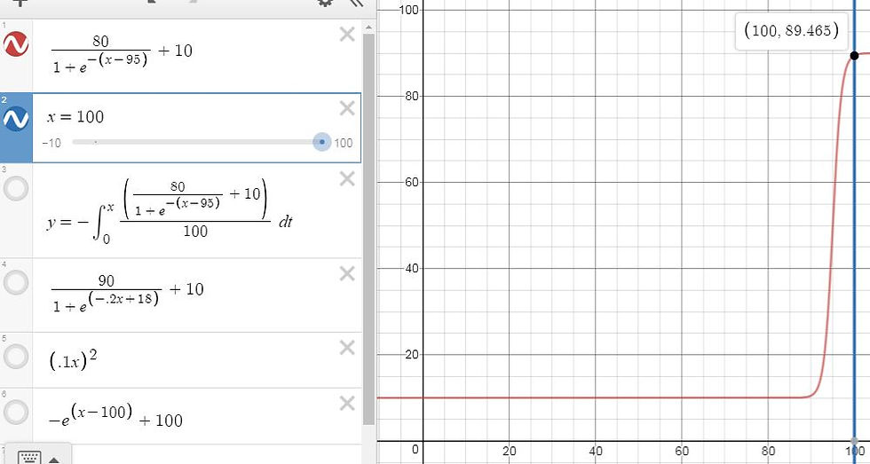
Living costs L(x) as a percent of income by income percentile likely has a derivative L`(x) with these limits:
L(x)=10% (some small percentage)
x->0
and
L(x)=90% (some large percentage)
x->infinity
*The little mark (`) by the capital L means the first derivative.
This simply means that living costs as a percent of income by income percentile falls much faster at higher income percentiles than at lower ones. Here is the graph of L`(x):
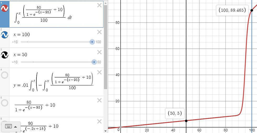
Integrating the formula for the red line gives H(x):

As you can see, living costs take up all income at the lowest percentile. The household at the exact median has perhaps 5% left over for savings or discretionary spending. At the highest percentile, households have nearly 90% left.
*As you can see, I made the integral negative. I did this because the function inside the integral is the rate at which living costs fall, meaning that Graph 1 could be negative to show rate of change, not the rate of decrease.
To find the cost of housing, H(x) must be multiplied by the income at each percentile. Income by percentile may look like the integral of Graph 1's function. This is not exactly to say that the models for living costs and income by percentile are related; I merely believe that incomes do not grow greatly at most percentiles but do at very high percentiles. Integrating gives this curve:
Multiplying (Income by Percentile) by (Housing by Percent of Income by Percentile) gives this curve:
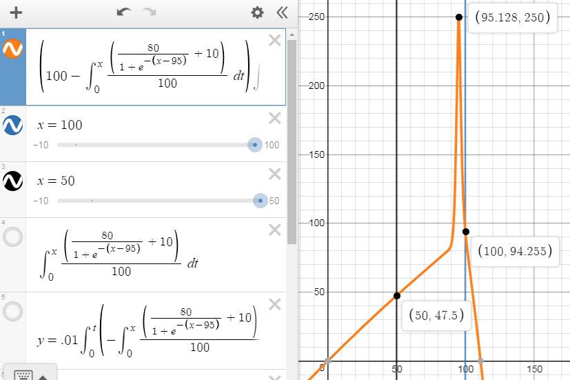
Viewing this graph suggests potential improvements. Income does not start at 0, as Graph 3 shows; even households with no wage at all (unlikely to exist) probably receive transfer payments. This means that Graph 4 should not start at 0. Furthermore, the income function has an inflection point before 100 as it is clearly concave up around x=90 and clearly concave down at x=100. This likely is not true in real life; the income curve would likely be concave up at all x-values. Unfortunately, my beloved logistic growth curves change concavity. Graph 4 should not show the cost of living rising before x=95.128 and falling afterwards. Nevertheless, the general shape seems accurate. The cost of housing rises steadily at most percentiles but increases greatly at very high percentiles.
----------------------------------
This can highlight the inequality in rich Western democracies (which on its own shows the power of capitalism to enrich the successful) that may only have its negative effects diluted by strategic government intervention.
Thank you for reading,
George Fane

that's good